An area chart looks like a Line graph with the region between the line and the x-axis filled in. The filled area emphasizes the magnitude of the quantity at each x value, not its shape alone. Single-series area charts are line charts with a visual nudge toward quantity matters. Area charts pull their weight in the stacked form, where multiple series are stacked on top of each other and the total area shows the cumulative quantity.
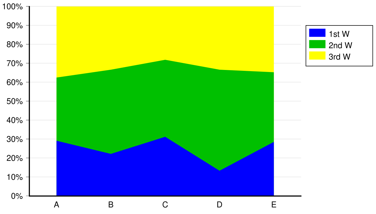 Image: Stacked 100% area chart, CC BY-SA 3.0
The typical use case is contribution or ratio visualization over time. Sales by representative across four months, with each representative’s line filled and stacked, makes it easy to see both:
- The total (the height of the top edge at each month).
- The individual contributions (the height of each band).
Stacked area charts share a weakness with stacked bar charts: bands above the bottom one don’t sit on a common baseline, which makes comparing them at a glance harder than it should be. If a representative grew their sales but everyone above them shrunk theirs, the band’s vertical position changes even though its height didn’t. Reading individual contributions accurately requires more visual care than a grouped chart would.
For categorical totals where the categories don’t have a meaningful order on the x-axis, area charts are inappropriate. They’re for continuous x-axes (time, age, position) where the filled area between successive points has a coherent meaning.
In Matplotlib, ax.fill_between(x, y1, y2) fills the area between two curves; ax.stackplot(x, *series) draws a stacked area chart from multiple series.