A bar chart compares values across a discrete set of categories using rectangular bars. A bar graph technically has horizontal bars; a column chart has vertical ones. Functionally they’re identical: orientation is a layout choice, not a semantic one, and bar chart in everyday usage covers both.
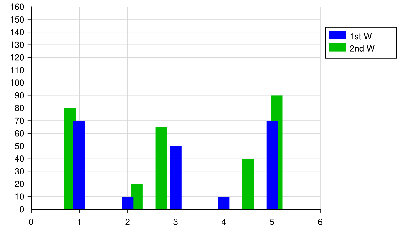 Image: Simple bar chart, CC BY-SA 3.0
The categorical axis carries the category labels (months, products, age bands, departments). The numerical axis carries the value being compared. The eye reads bar length precisely, which is what makes the chart work: differences in length translate directly into perceived differences in value.
Variants:
- Single series. Salary by month, one bar per month.
- Multiple series. Salaries of two engineers across four months, each month gets two adjacent bars.
- Grouped or stacked. Counts of patients in three age bands, split into healthy and unhealthy, drawn as two adjacent bars per band (grouped) or as one stacked bar per band (Stacked bar chart).
They handle a fair bit of complexity: eight categories with three series each, twenty-four bars in total, can still be readable.
Bar charts are the wrong choice when the x-axis is continuous. Showing vehicle velocity over time with one bar per second loses the sense of continuous evolution and falsely suggests the velocity exists only at discrete moments. For continuous x-axes, Line graph is the right tool.
In Matplotlib, ax.bar(categories, values) draws a vertical column chart; ax.barh(categories, values) draws a horizontal bar graph. The width parameter controls bar thickness; for grouped bars, offset the x-coordinates of the second series by the bar width.