A bubble chart is a Scatter plot with a third variable encoded in the size of the dots. Each point has a position given by and and an area proportional to a third value. Interest rate vs. month, with the area of each bubble showing the number of customers, is the kind of question it answers well.
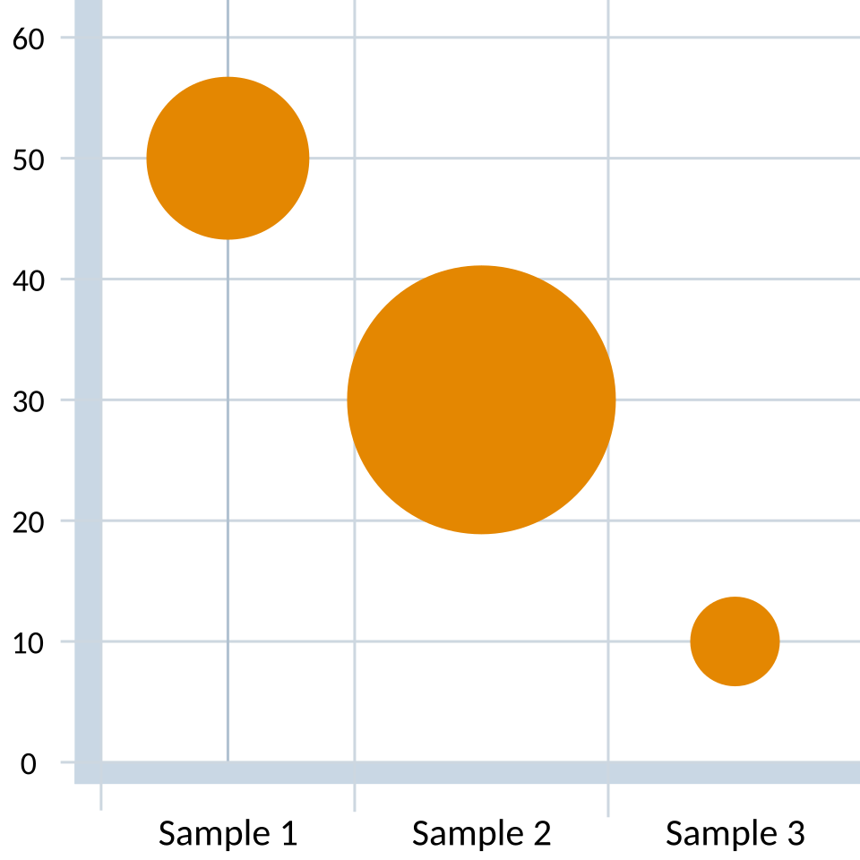 Image: Bubble chart with three variables, CC BY-SA 1.0
The eye reads area less precisely than position, so the third variable is a soft signal: good for direction and rough magnitude, not exact values. That’s the tradeoff. You get a third dimension on a 2D page, but it’s communicated less precisely than the other two.
Encode the third variable as area, not radius. The eye reads area roughly linearly, so if the variable is , the bubble area should scale as , not as . The pitfall is setting bubble radius (or diameter) proportional to : area scales as radius squared, so a 5× value difference becomes a 25× visual difference. In Matplotlib the s parameter is already area (in points²), so passing s=value is the correct linear-in-area encoding; s=value**2 would exaggerate.
For more than three variables, color and shape can be layered on top of position-and-size, but the chart quickly becomes hard to read. Each new visual channel costs the reader effort, and at some point the chart communicates less than two separate charts would.
In Matplotlib, ax.scatter(x, y, s=areas) is the bubble chart. s is the marker size in points squared, which is the area.