Sensitivity analysis answers one question: if this input changes, how much does the outcome change? Vary one input parameter over a plausible range, holding everything else fixed, and watch how the outcome metric (PW, IRR, AC) responds. Repeat for each input.
 Tornado diagram: factors ranked by NPV sensitivity to a ±range swing.
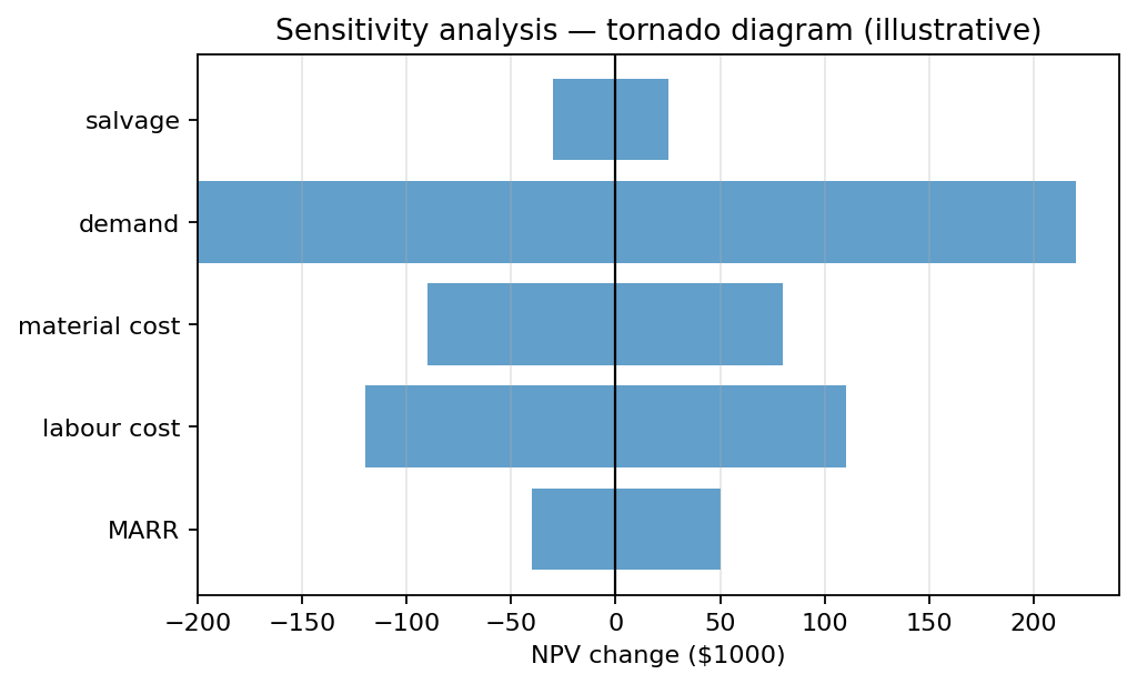
A sensitivity graph is the standard output: outcome on the y-axis, parameter value on the x-axis, with the project’s base case sitting at the centre. The slope of the line tells you how sensitive the outcome is to that parameter. Steep slope means small changes in the input produce big swings in the outcome.
Common parameters to vary:
- MARR, the discount rate.
- First cost (capital cost).
- Annual operating costs.
- Annual revenue or savings.
- Project life.
- Salvage value.
The parameters with the steepest slopes matter most. Spend the extra effort estimating those accurately, and watch them as the project unfolds: if any moves substantially from the base case, the PW could swing across zero.
A typical sensitivity-analysis workflow:
- Establish the base-case PW (or IRR, AC, etc.) using best-estimate inputs.
- For each input, recompute the outcome at, say, around the base case.
- Plot all the sensitivity lines on one graph for visual comparison.
- Identify the inputs whose plausible variation pushes the outcome across the accept/reject threshold. These are the critical assumptions; re-examine them before committing.
Strengths. Simple to compute and explain. No probability estimates required. Highlights which inputs deserve more attention. Useful early in project evaluation, when uncertainty is high but quantitative risk modelling is premature.
Weaknesses. Varies one parameter at a time, so it misses interactions. In reality several parameters move together (demand and price, cost and schedule, labour rate and project length), and ignoring those correlated movements can make the analysis underestimate risk. The tornado diagram and Monte Carlo simulation are the next steps if sensitivities suggest the project is truly risky.
A tornado diagram is a horizontal bar chart with one bar per input parameter, each spanning from the outcome at “input low” to “input high” (e.g. ±20%) and centred on the base-case outcome. Bars are sorted by absolute width, biggest swing at the top, smallest at the bottom, giving the tornado-funnel silhouette. The top bars are the parameters whose plausible variation matters most.
Break-even analysis is the related technique that finds thresholds rather than sensitivities. For the probability-weighted alternative, decision tree and Expected value (engineering economics).