The ROC curve (Receiver Operating Characteristic curve) is a plot of true positive rate against false positive rate as the classification threshold is varied. It characterizes a binary classifier’s behaviour across all possible thresholds, not just one.
 ROC curves at three skill levels. The diagonal is random; AUC is the area under each curve.
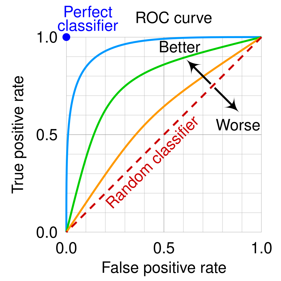 Image: ROC curve with random-classifier diagonal, CC BY-SA 4.0
The name comes from radar engineering during the Second World War. Receiver operating characteristic described how well a radar receiver could distinguish enemy aircraft from noise as the operator’s detection threshold varied. We’ve inherited the name and applied it to all binary classifiers.
What the plot shows
The ROC curve has FPR on the x-axis and TPR on the y-axis. Both range from 0 to 1.
- At threshold (no example predicted positive): , . The curve starts at the origin.
- At threshold (every example predicted positive): , . The curve ends at the upper-right corner.
- In between, the curve sweeps up and to the right as the threshold lowers. Each example crossing the threshold contributes either a TP (which pushes TPR up) or an FP (which pushes FPR right).
Three reference cases:
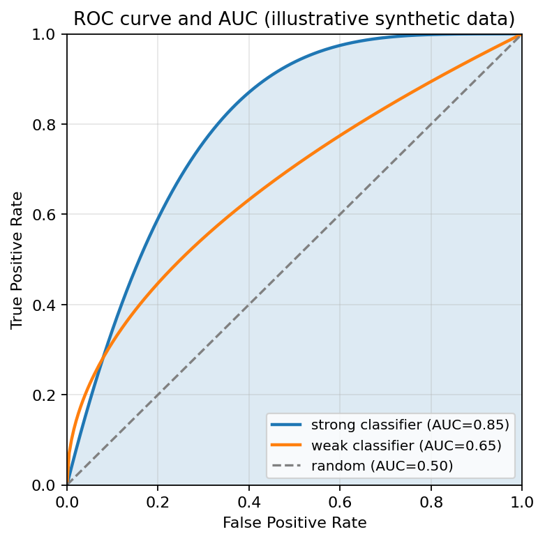
- A perfect classifier has an ROC curve that goes straight up to and then straight across to : at some threshold it achieves perfect separation between positives and negatives.
- A random classifier (no better than coin flip) traces the diagonal from to . At every threshold, the fraction of caught positives equals the fraction of false alarms.
- A real classifier falls somewhere between, with a curve that bows up and to the left. For any given FPR, it achieves a higher TPR than random.
Computing the curve
The curve is constructed by sweeping the threshold from very high to very low. At each threshold, count the TPs and FPs, compute TPR and FPR, plot the point. With many test examples, the resulting curve is essentially smooth. With few, it’s a staircase: each example crossing a threshold causes a discrete change in either TP or FP, not a smooth one.
A worked example from the Introduction to Data Science textbook: seven test examples with true labels and predicted probabilities produce a five-step staircase from to , with steps at , , , , , , .
Why this is useful
A single-threshold metric like accuracy or F1 score tells you how the classifier performs at one specific operating point. The ROC curve tells you how it performs across all operating points, much more information. Two classifiers with the same accuracy at threshold 0.5 can have very different ROC curves and behave very differently at other thresholds.
For a single-number summary of the whole curve, use AUC, the area under the curve. Higher is better; 0.5 is random; 1.0 is perfect.
In scikit-learn
from sklearn.metrics import roc_curve, RocCurveDisplay
fpr, tpr, thresholds = roc_curve(y_test, y_prob)
RocCurveDisplay(fpr=fpr, tpr=tpr).plot()
plt.show()
y_prob is the predicted probability of the positive class (not the hard prediction). The pos_label= argument specifies which class is positive when the labels aren’t . The drop_intermediate=False argument keeps every threshold rather than removing redundant points along straight segments.