Supply and demand is the simplest model of how prices and quantities are set in a market. Two curves on the same (quantity, price) axes:
 Supply and demand curves intersect at the market-clearing price/quantity.
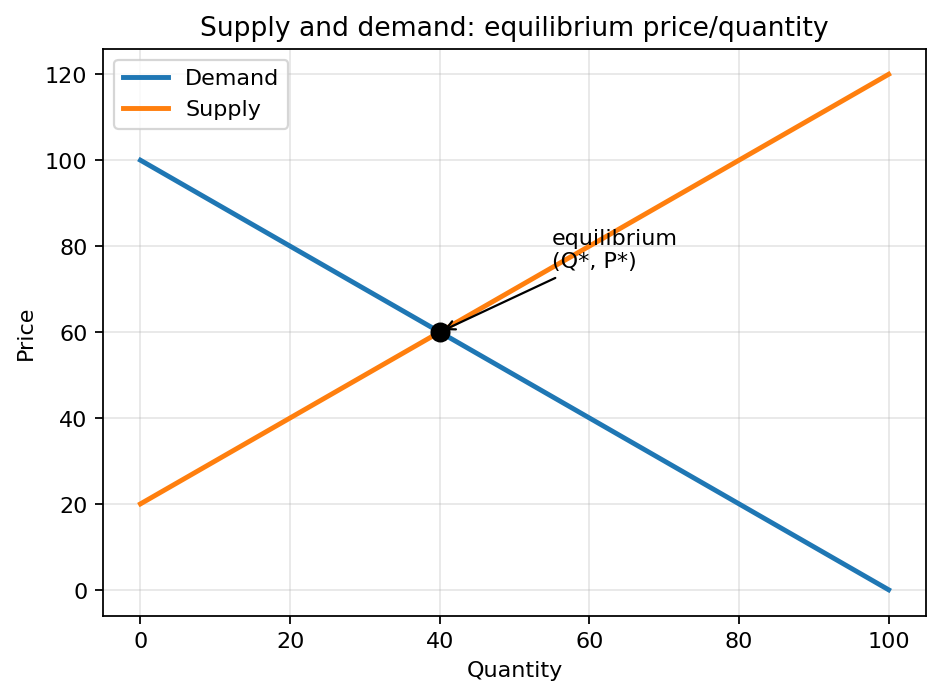
- The demand curve slopes down: at higher prices, customers want less of the thing.
- The supply curve slopes up: at higher prices, producers are willing to make more of the thing.
Where they cross is the market equilibrium: the price at which the quantity customers want to buy equals the quantity producers want to sell. Markets don’t usually sit exactly at equilibrium, but they’re pushed toward it. If the price is above equilibrium, sellers can’t unload all their stock and have to cut prices; if it’s below, customers competing for limited supply bid prices back up.
The downward slope of the demand curve comes from two effects. Substitution: if a thing gets more expensive, customers switch to alternatives. Income: if a thing gets more expensive, customers can afford less of it overall. Both effects push quantity demanded down as price rises.
The upward slope of the supply curve comes from the fact that higher prices justify drawing in higher-cost producers (whose marginal production cost was below the new price but above the old) and higher-cost production methods (overtime shifts, less efficient equipment). At high enough prices, producers will eventually run into capacity limits and the curve goes nearly vertical.
In engineering-economic decisions this shows up in pricing analysis (“if we charge , what quantity will we sell?”), in cost-volume-profit analysis (combine the demand curve with the firm’s Total cost curve to find profitable price-quantity combinations), and in Break-even analysis (find the quantity where revenue meets total cost).
A typical exam-style picture combines total revenue (hump-shaped: rises with at first, then falls as you have to cut price to sell more) with total cost (linear). The interval of where is the profitable region, sometimes drawn as a shaded area between the two curves.